jQuery Mobile
jQuery Mobile
jQuery Mobile is a framework for creating mobile web applications.
jQuery Mobile works on all popular smartphones and tablets.
jQuery Mobile uses HTML5 & CSS3 for laying out pages with minimal scripting.
What You Should Already Know
Before you start studying jQuery Mobile, you should have a basic knowledge of:
- HTML
- CSS
- jQuery
What is jQuery Mobile?
jQuery Mobile is a touch-optimized web framework for creating mobile web applications.

jQuery Mobile is built on top of the jQuery library, which makes it easy to learn if you already know jQuery.
It uses HTML5, CSS3, JavaScript, and AJAX to accomplish its work for laying out pages with minimal scripting.
Why Use jQuery Mobile?
jQuery Mobile takes the "write less, do more" to a new level: It automatically design web pages with an attractive and "easy-to-use" look, that will work the same way on all mobile devices.
Instead of writing one application for each mobile device or OS:
- Android and Blackberry is written in Java
- iOS is written in Objective C
- Windows Phone is written in C# and .net, etc.
jQuery Mobile solves this problem, as it only uses HTML, CSS and JavaScript, which is standard for all mobile web browsers!
Best Reading Experience
Even though jQuery Mobile works on all mobile devices, it may have some compatibility issues on desktop computers (due to limited CSS3 support).
Adding jQuery Mobile to Your Web Pages
There are two ways to add jQuery Mobile to your web site. You can:
- Link to a jQuery Mobile library stored at a CDN (recommended)
- Link to a jQuery Mobile library stored at your computer
Link to jQuery Mobile From a CDN
A CDN (Content Delivery Network) is used to distribute often-used files across the web.
This makes download speed much faster for the user.
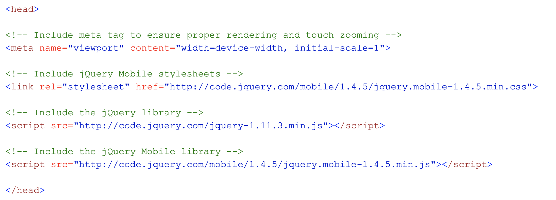
As with jQuery core, there is nothing to install on your computer; you just include the following stylesheet (.css) and JavaScript libraries (.js) directly into your HTML page, to get jQuery Mobile to work:

The viewport <meta> tag inside the <head> element specifies how the browser should control the page zoom level and dimensions.
The width=device-width sets the width of the page to follow the screen-width of the device (which will vary depending on the device).
The initial-scale=1 sets the initial zoom level when the page is first loaded by the browser.
This makes download speed much faster for the user.
Link to jQuery Mobile Stored at Your Computer
If you want to host the jQuery Mobile library yourself, you must first download it from jQuerymobile.com.
Then add the following code to your page:
<head>
    <meta name="viewport" content="width=device-width, initial-scale=1">
    <link rel="stylesheet" href="jquery.mobile-1.4.5.css">
    <script src="jquery.js"></script>
    <script src="jquery.mobile-1.4.5.js"></script>
</head>
Tip: Place the downloaded files in the same directory as the pages where you wish to use it.
Do you wonder why we do not have type="text/javascript" inside the <script> tag?
This is not required in HTML5. JavaScript is the default scripting language in HTML5 and in all modern browsers!